Thursday, 21 April 2016
Evaluation
1) In what ways does your media product use, develop or challenge forms and conventions of real media products?

2) How effective is the combination of your main product and ancillary texts?
When creating my main video and ancillary texts, I aimed to keep them cohesive to one another so that they complimented each other but also was represented as a package/brand. I believe that the main thing that puts my texts together is the use of colour and also the use of imagery such as the ink in water. I wanted to be very aware on colour throughout postproduction by adding blue/purple tints to my moving image as this is conventional of an indie/pop brand. This could also reflect the mood of the video and song. Furthermore, this colour scheme was represented within the artists name 'Izzy Blue'.
Some screenshots will show the continuity between my texts and the uses of purples and blues throughout my video and ancillary texts.


When establishing a setting and theme for my texts I wanted something relatable to an audience. This is why I chose settings such as a bedroom ad bathroom, something almost cosy but a place where a person can relate and refer to and somewhere that can be very personal to a person. I feel like my adding more blue/grey filters to the texts, it changed the mood and perspective, whereas if I had added a warm tint over the top of the video and posters, it might have had a totally different story and effect on the audience. Furthermore, throughout my texts there is a theme of 'hidden identity'. At the beginning of my planning I wanted there to be no eyes in the video at all, so that you couldn't see the identity of the person. This however, turned out more difficult than expected but I feel like I somehow slightly kept this theme running through. Whether it be only the eyes being the focus of the face or the faces on the posters almost moulding into the ink in the background. In my opinion, this is also one of the most important things when keeping my media texts cohesive to one another. Even though, I really enjoy my texts as a whole, there could be improvements and may be more variety as some people would think that everything is too similar and it becomes boring, however I don't think this is the case (in my opinion).
Some screenshots will show the continuity between my texts and the uses of purples and blues throughout my video and ancillary texts.


I tried to keep a theme running throughout my media texts and I think that is what makes them so strong as an outcome. Eventhough, the forms of the texts were different they still were just as effective and clearly go together as a package. I believe that an audience reacts well so this because it makes the texts looks realistic and professional and also due to the song and setting, it is relatable for a viewing audience.


3) What have you learned from your audience feedback?


Monday, 18 April 2016


Thursday, 24 March 2016
Ancillary Text Process


This is simply an idea and me experimenting with how to do my ancillary texts. I took a screen shot from my video and placed it on black background. I then used the filter gallery to add a cracked and old effect to the eye. I also changed the levels and hue of the eye slightly to link the colours more to my video. I am also going to paint the eye by hand and scan it in to photoshop and see what affect it gives.


I then used layers and the paint tool to create a simple white linear effect around the perimeter of the eye. I then duplicated the layer twice and changed the opacity to create a blurred effect.

Monday, 21 March 2016
Existing Album Artwork
CHVRCHES- EVERY OPEN EYE

This album artwork explores the mix between historical and bold futuristic elements. This is due to the iconic and traditional roses and the pixelated colours. This cover was designed by Austrailian Designer Amy Burrows, who did all of their band artwork down to the logo. She subtly distorts a classic photo or painting with a bold pretty effect.


They kept this pretty pink rose theme throughout their promotion too creating continuity and making all their products more professional.
FKA TWIGS-LP1

Visual artist Jesse Kanda manipulated and disfigured one of 2014's most compelling artists to create the surreal album cover for LP1's. Immitating confused artist Francis Bacon and Margaret Keane. It introduces fluidity and strange beauty into the music world.

Francis Bacon
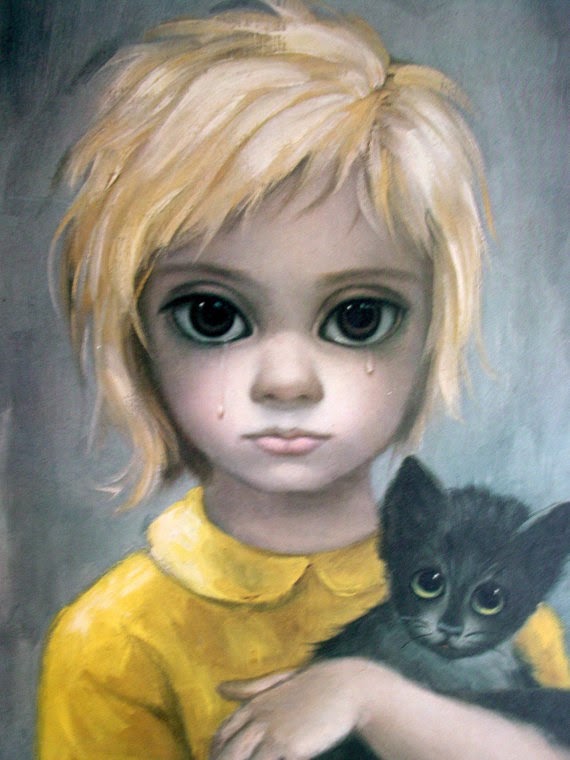
Margaret Keane

FEADZ: INSTANT ALPHA

Ideas For Ancillary Texts: Planning and Research
When thinking about my album artwork and digipak, I wanted something that related to the video and that was abstract and could have multiple meanings.


 Using materials such as paint and ink can create emotion within a design and make it look unusual and raw. These images above inspired me to hand render my own design.


Subscribe to:
Posts (Atom)